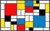
 My websites main purpose is to showcase my academic and personal works. One of the goals for my site is to incorporate my personal style and aesthetic into my blog posts and pages. I am from Panama, a tropical country where bright and warm colors are predominant. Through my photography I try to convey strong visual energy using bright and saturated colors. Most visual elements found on my site are my own photographs and renderings. There are a couple of artists and genres that have inspired me, and combining them together I aim to create my own style. For example, Piet Mondrian a Dutch painter that is very well known for creating complex compositions based off of basic shapes, primary colors, and flattened forms. Similar to Mondrian, I am attracted to the basic vertical and horizontal elements of design, and find them in architectural structures in order to create a dynamic balance in each composition. His designs mirror the concept of using simplicity to create something complex, reinforcing the idea that something magnificent can come from something plain. Similarly, I aim to model my website based on these principles. Another genre that inspires me is glitch art, which is art made from technology. I am very interested in the study of innovations and modernity, and glitch art is able to create something powerful from the errors that stem from technology. It emerges from inaccuracies and in the least expected ways comes to life and is rendered by an abstract vision. 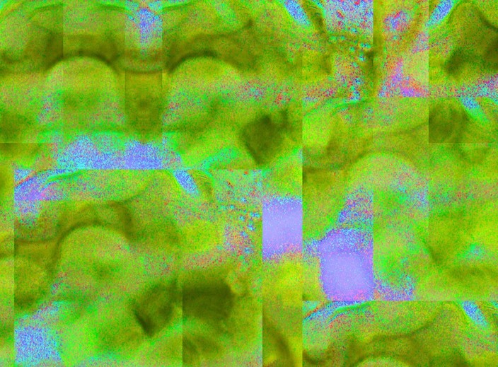 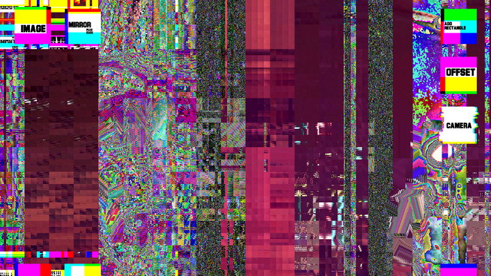 Another artwork that has inspired me is Coldplay’s music video “Up and Up.” The 3-minute video is a collage, combining several different clips that do not have much in common but put together are able to transmit a very strong message. What I love about the video is the immense amount of creativity that took into creating a sequence of events pulled from the past, present and future in order to create a time and space of its own. I added a cover photo to each page page on my site. The picture I chose for the Digital Media and Culture page is a collage I made from an Image I took of buildings. I deconstructed the image and cropped parts of the buildings, mixing textures and colors. I thought this image was appropriate because it represents a fast past environment that resembles many discussions we have in class regarding technology and the every changing world we live in. The collage has images of road signs that give contradicting directions. There are multiple "one way" signs that do not actually indicate a direction, and stop signs intertwined within the blocks of texture. These symbols reflect our current political environment, which is tumultuous, confusing, and multidirectional. The paged called Media Gallery exhibits some of my digital collages. I decided to use a slideshow format to showcase the images, because it allows the pictures to be displayed individually giving each one a space of its own given most of the images are very busy and visually complex. A common pattern I use in most of my digital collages is a kaleidoscopic effect, creating a distorted space which abstracts and disclaims objects realistic properties. The image I chose for the home page of my site is a collage I made out of lights. I wanted the first page people would see on my website to be bright and call the reader in. On the bottom of my home page I included icons that link to my photography social media platforms, in order for the reader to get more information on my work. This is how my website looked before:
0 Comments
Leave a Reply. |
AuthorI am from Panama and a sophomore at Emory University. I am passionate about photography and media making. Archives |
 RSS Feed
